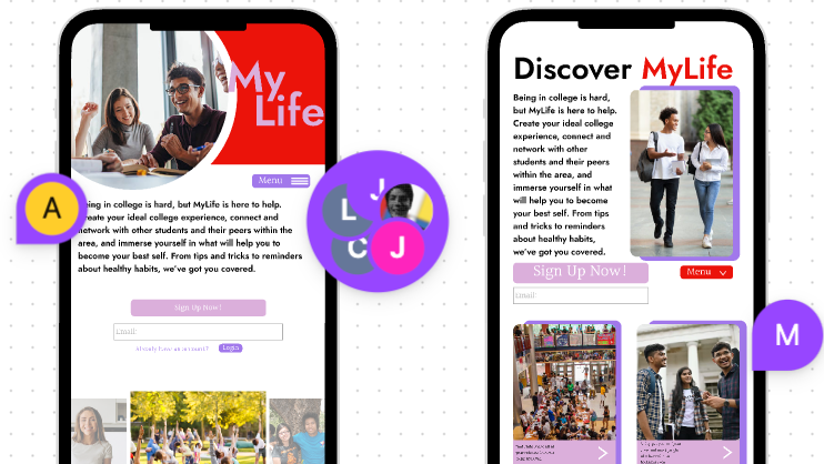
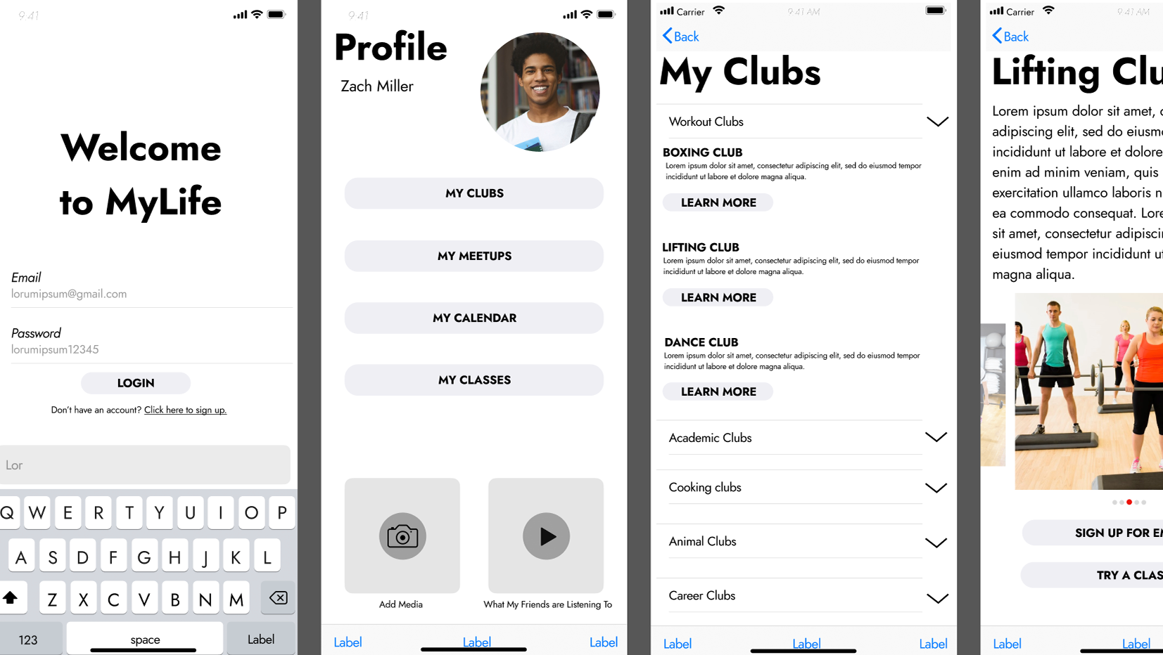
From the start, we knew that we wanted a strong accent color in order to highlight the main tasks and affordances of the app. The app has to be clearly understood, fun to use, helpful, and beneficial to the user in order to solve the problem at hand.
Sketching out completing tasks
First ideation that was revised for simplicity and legibility later on


